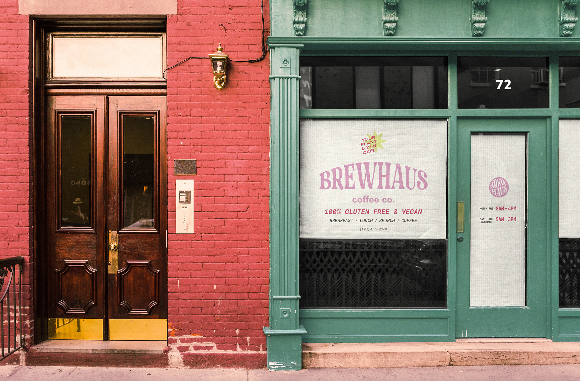
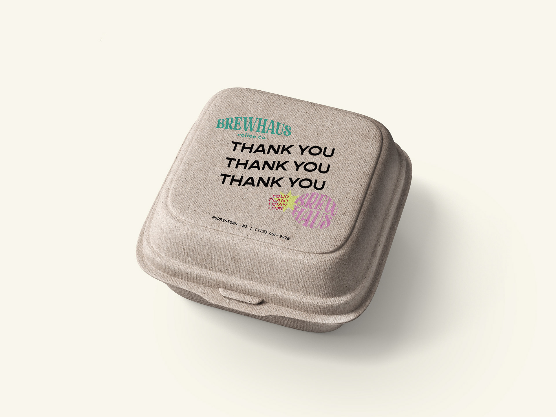
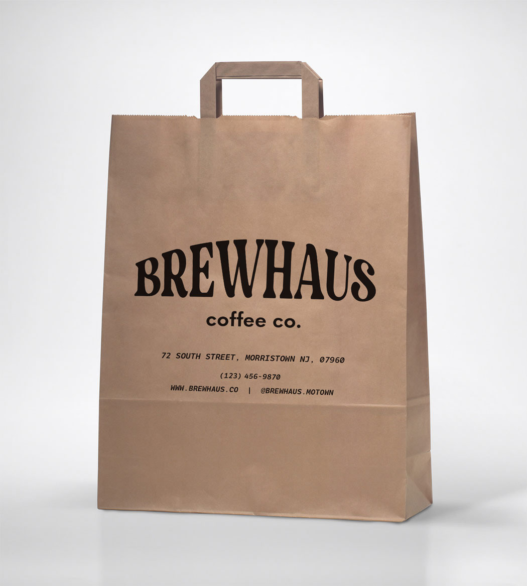
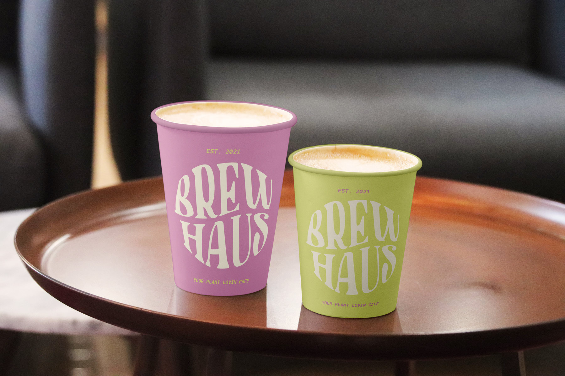
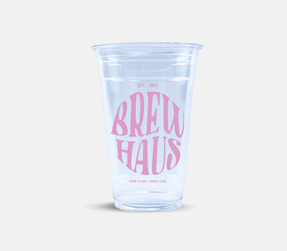
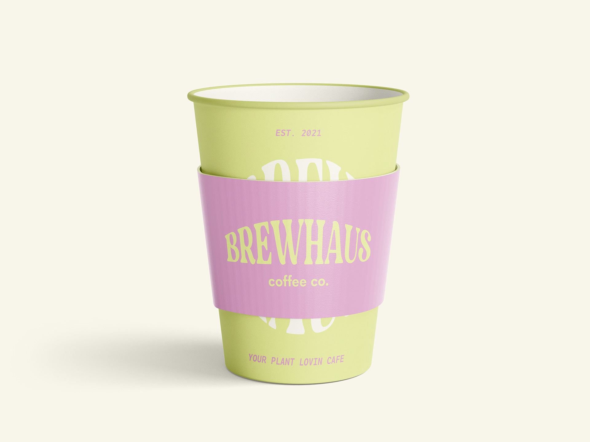
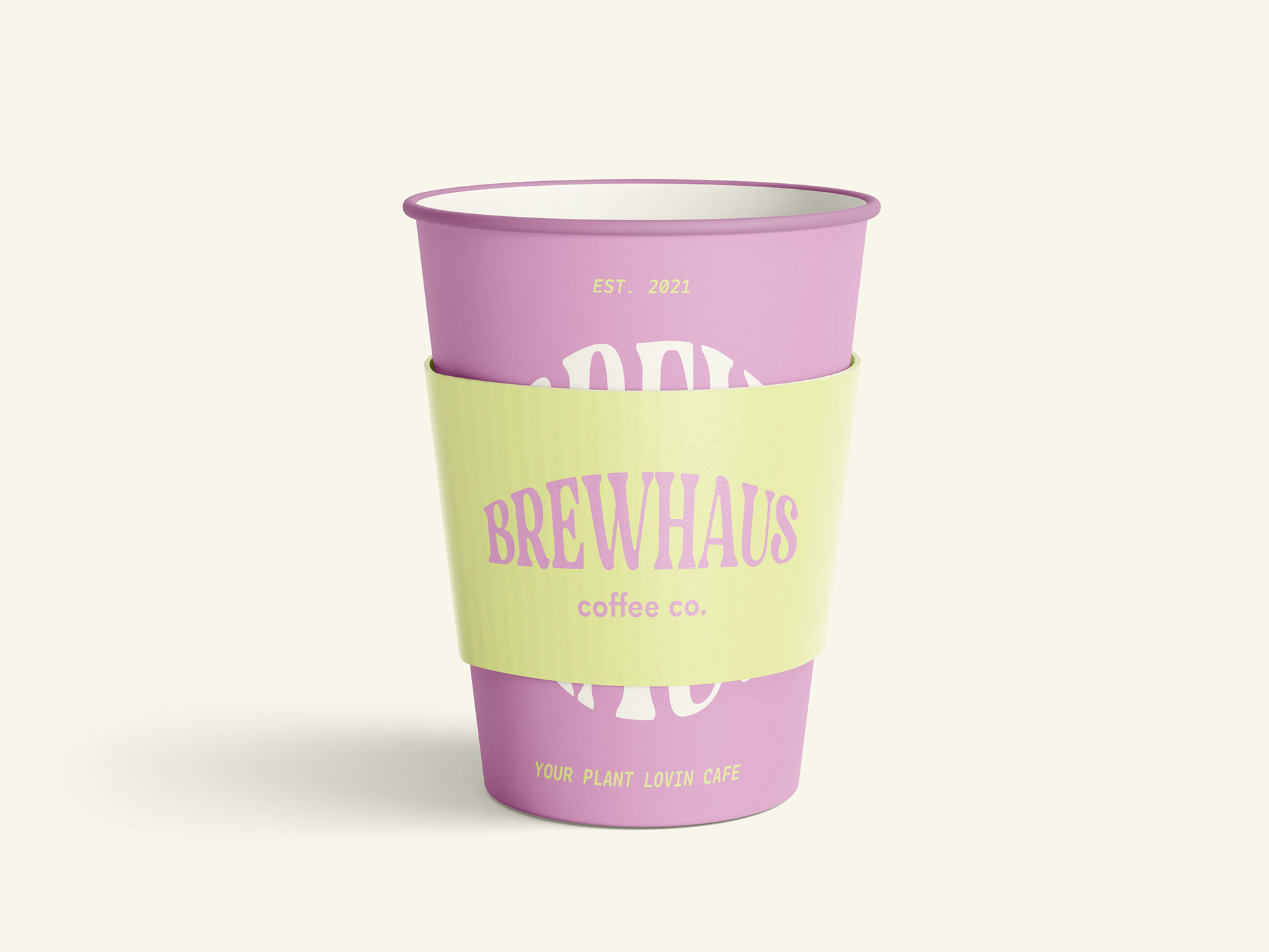
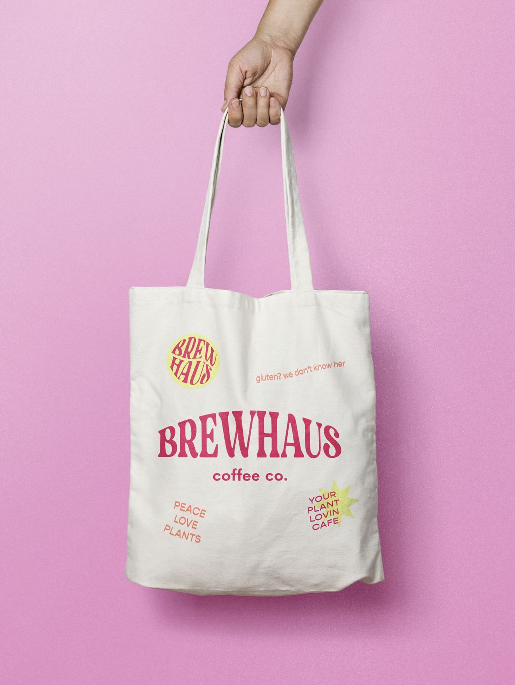
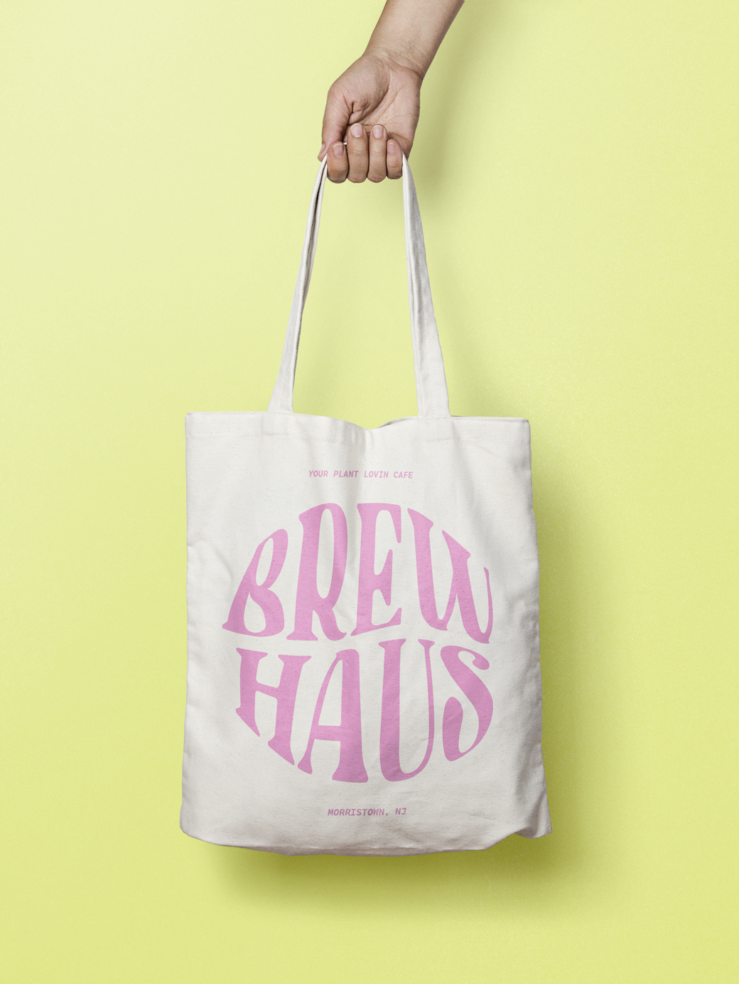
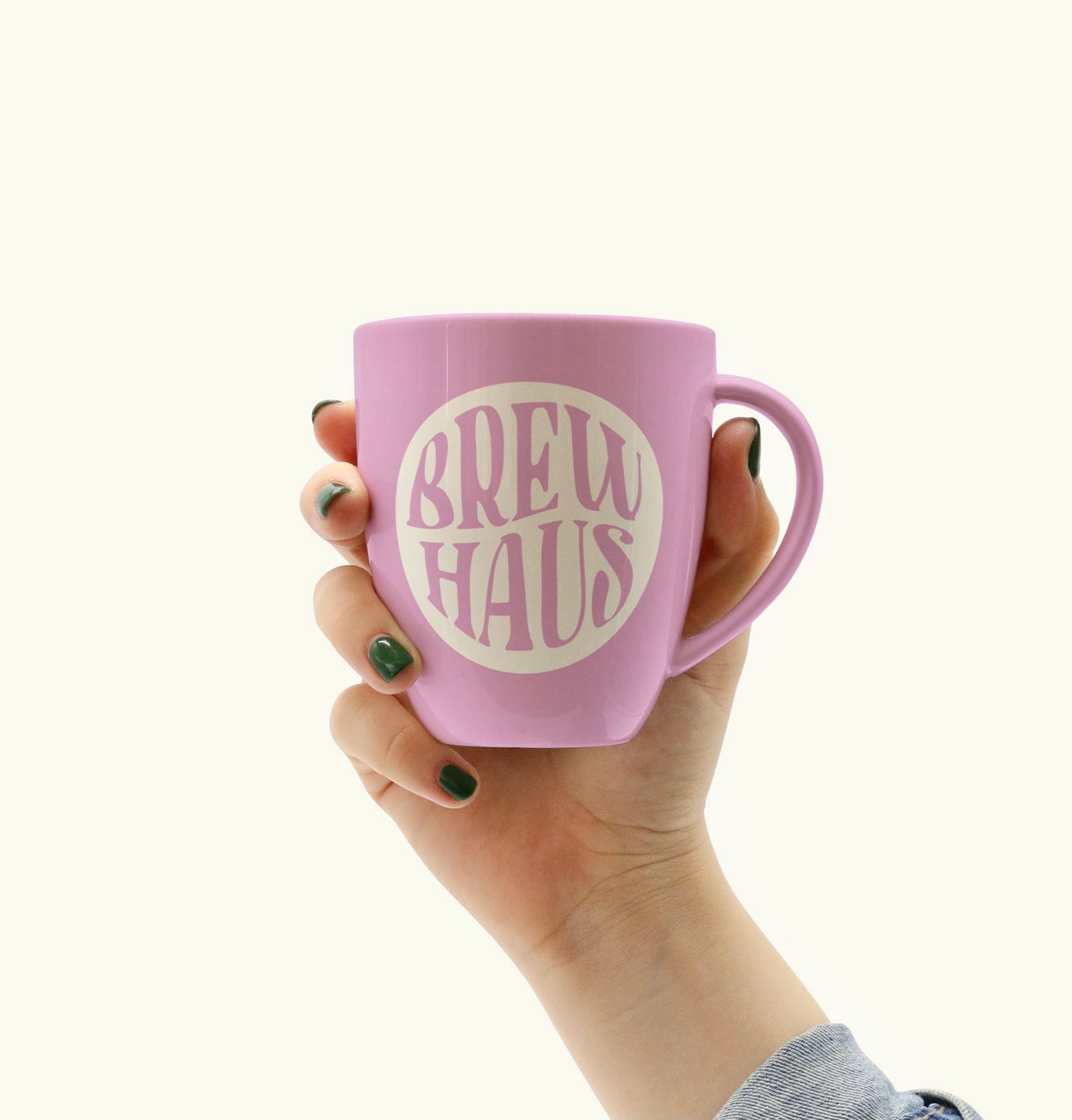
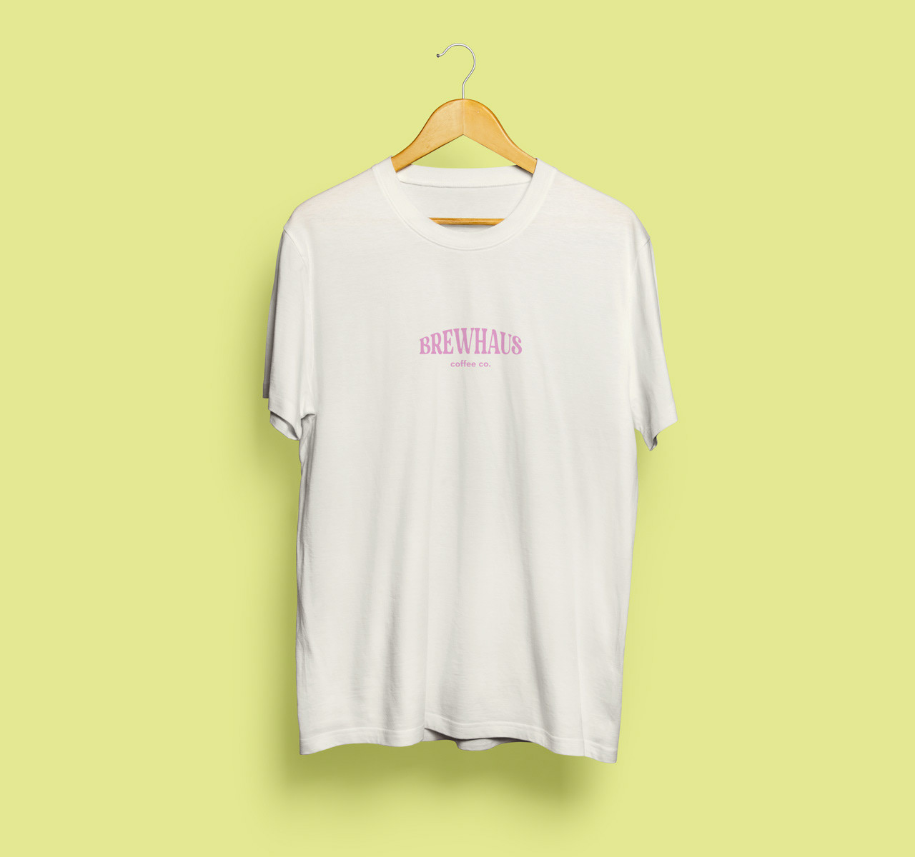
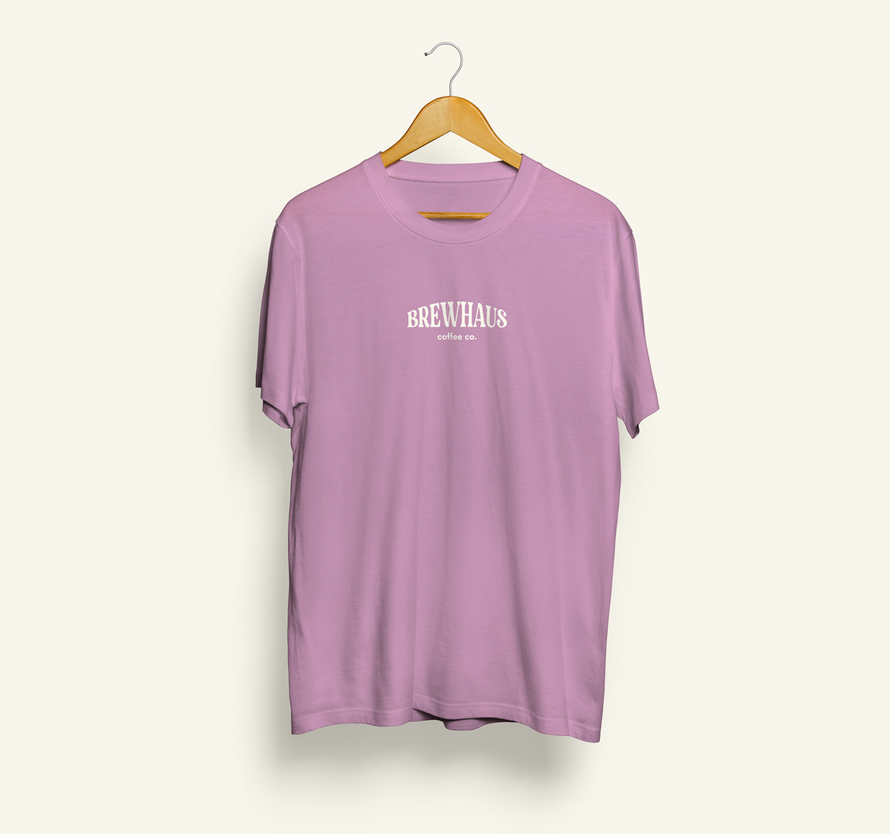
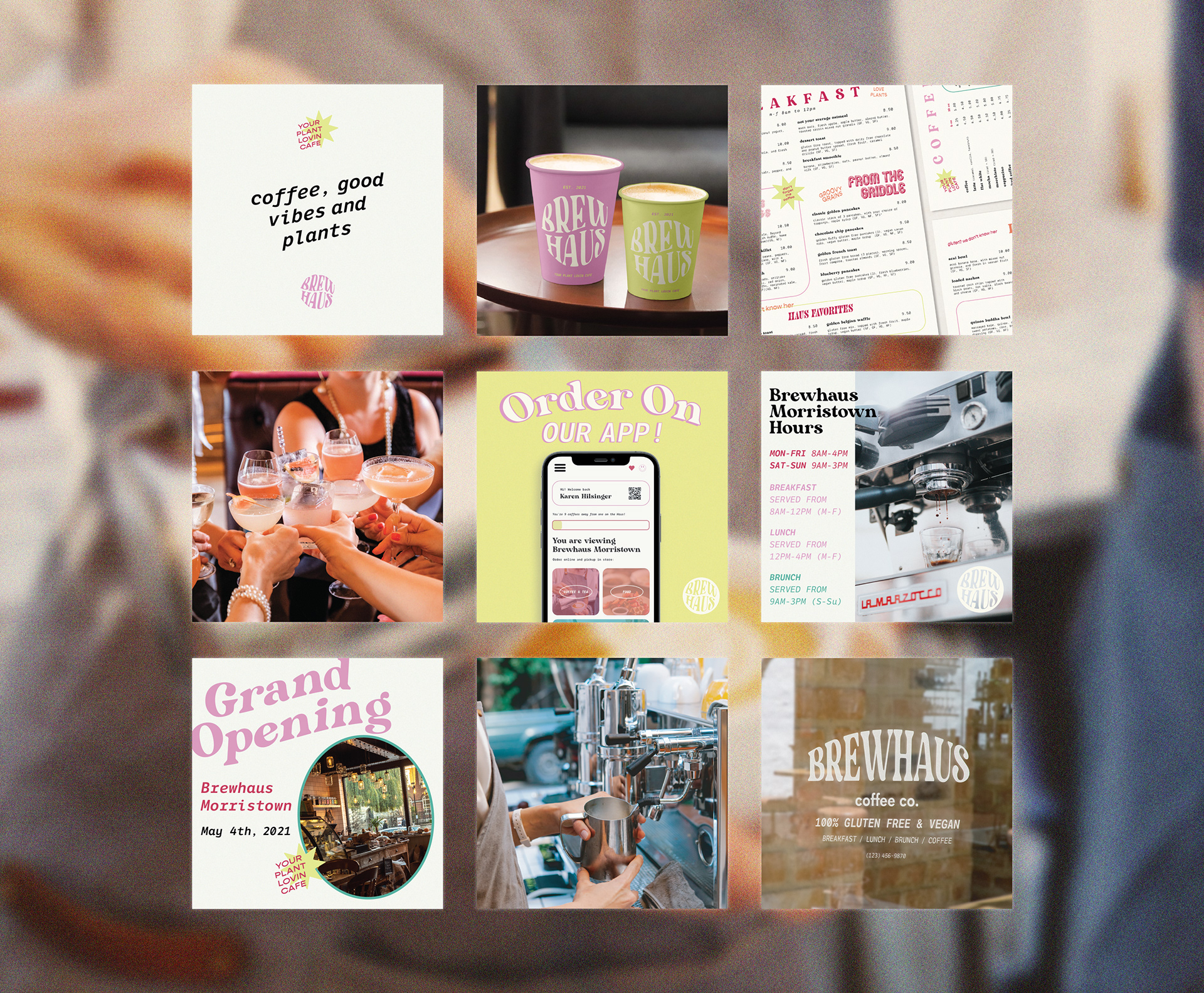
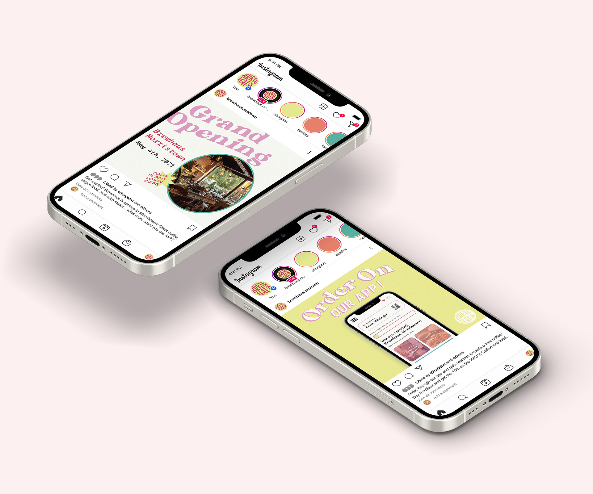
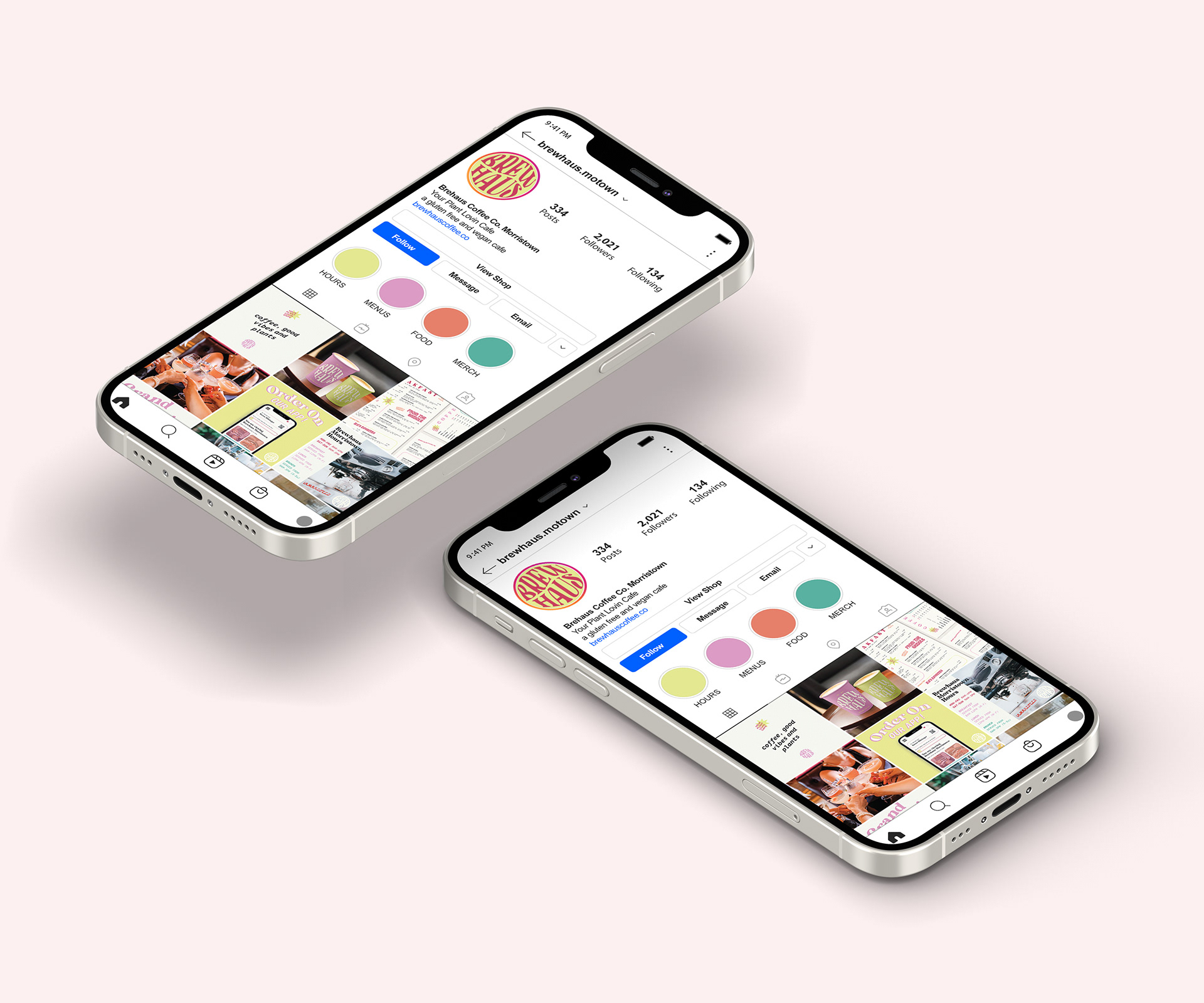
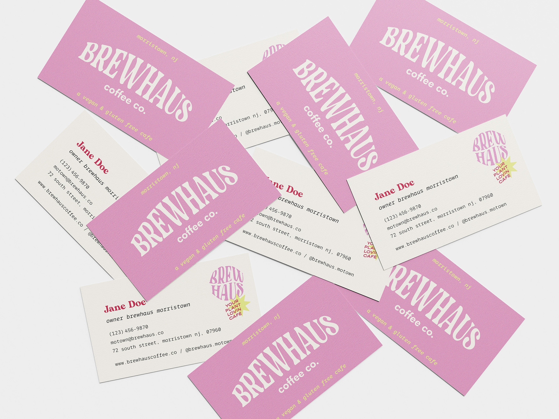
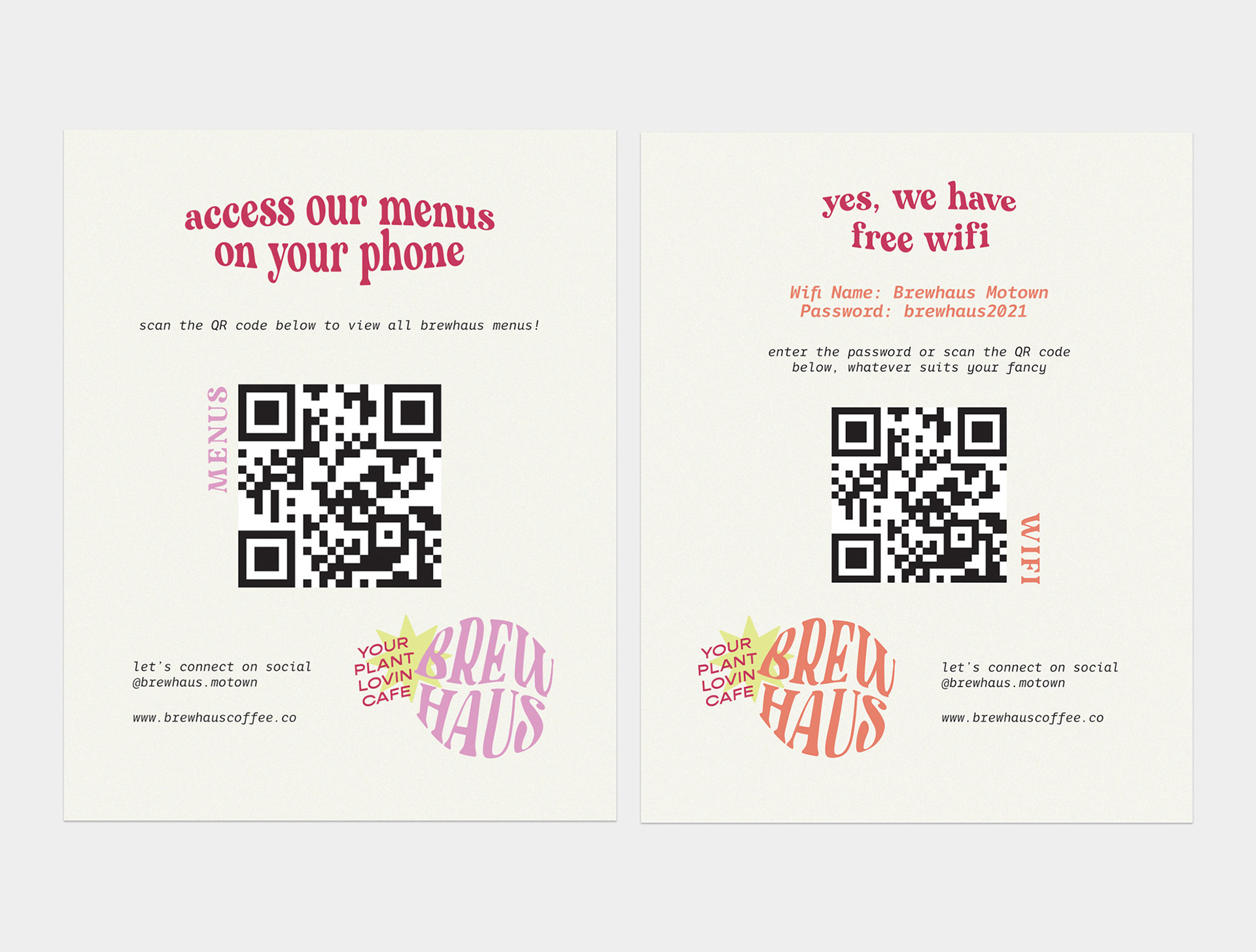
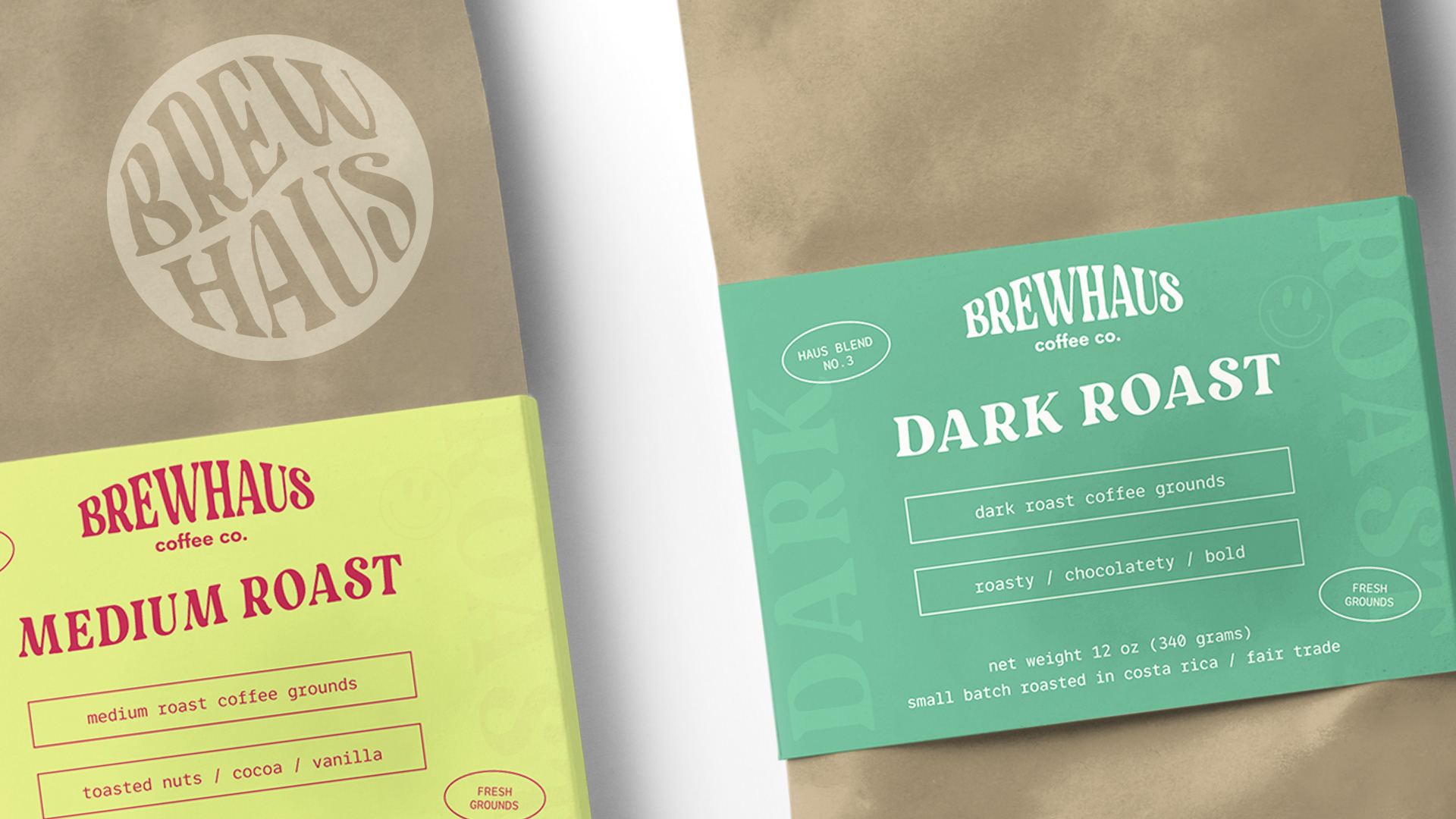
Here you can view Brewhaus all on one page. I thought it would be beneficial to see all elements working together as I had envisioned in my mind. Starting with branding and ending with social media design, the entire project can be scrolled through on this page.
MY GOAL
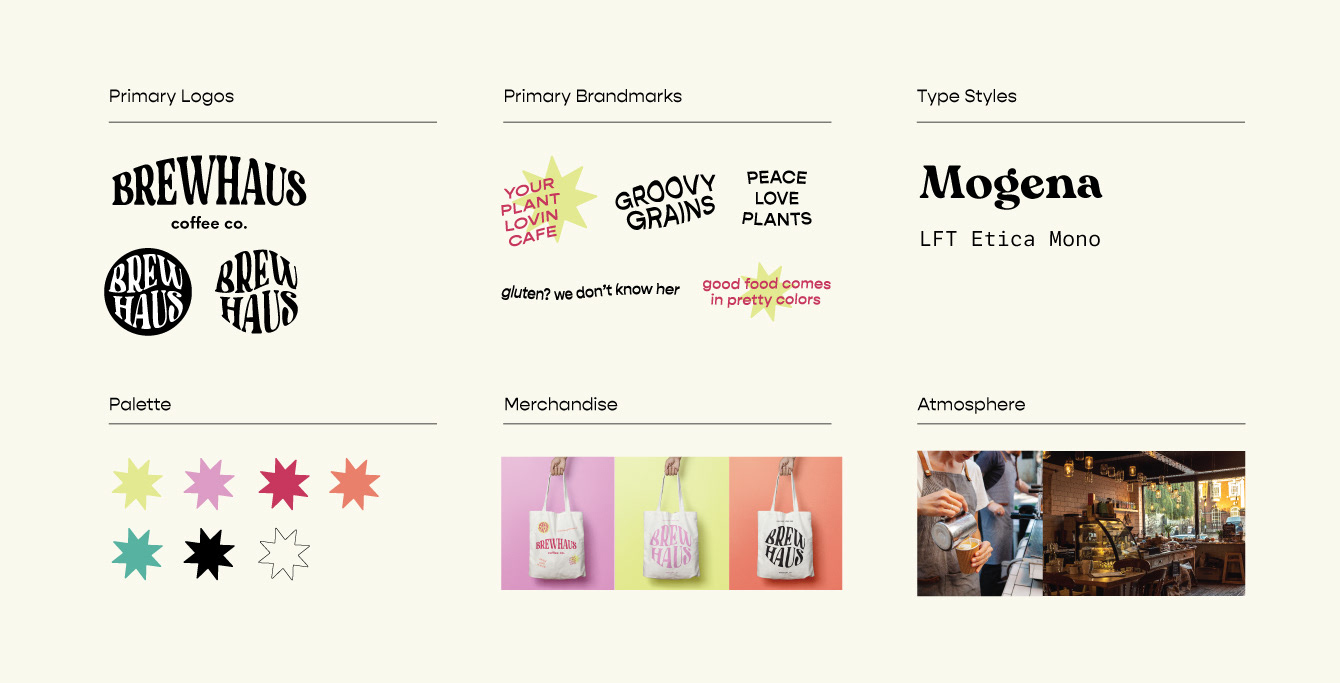
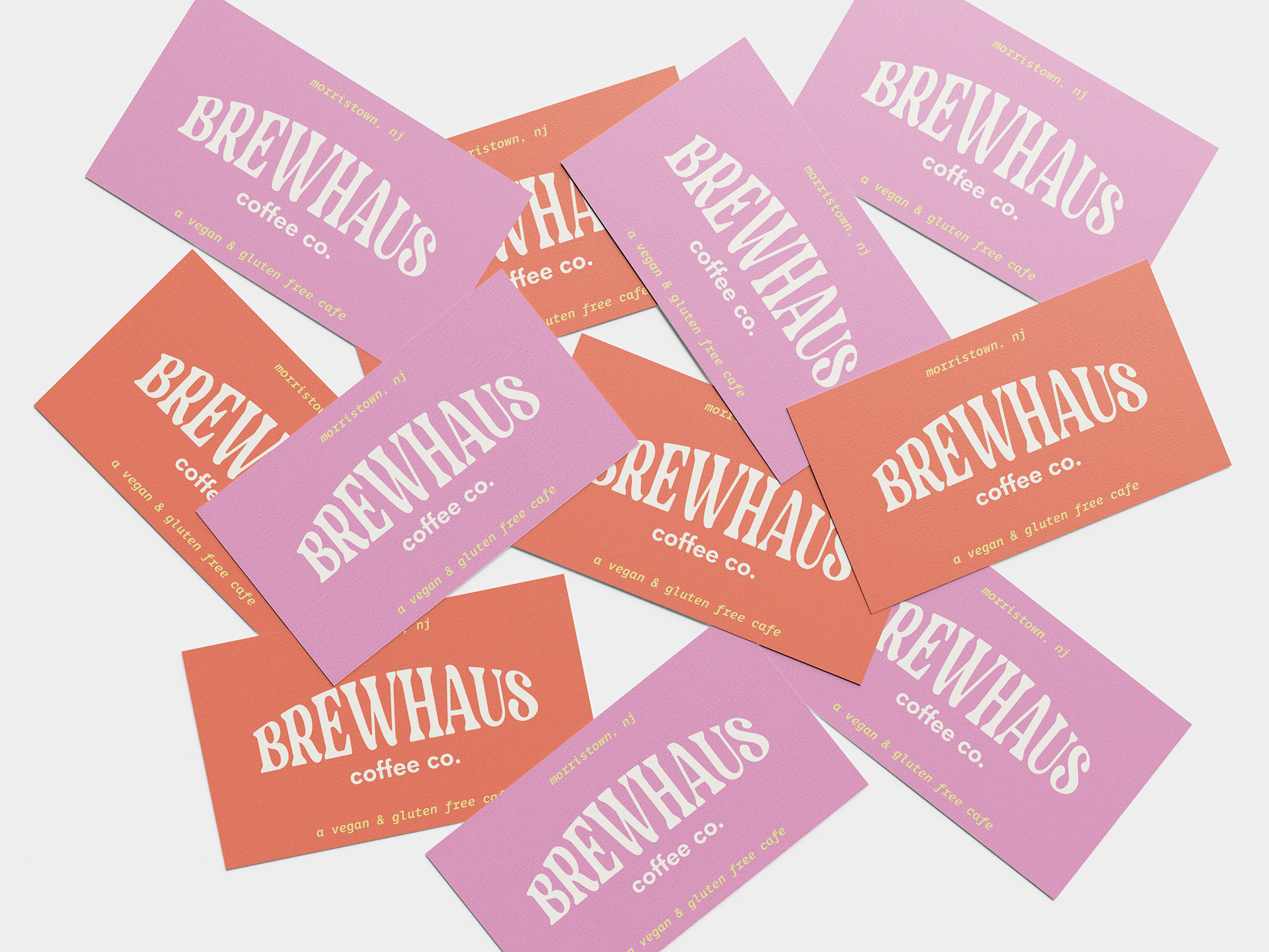
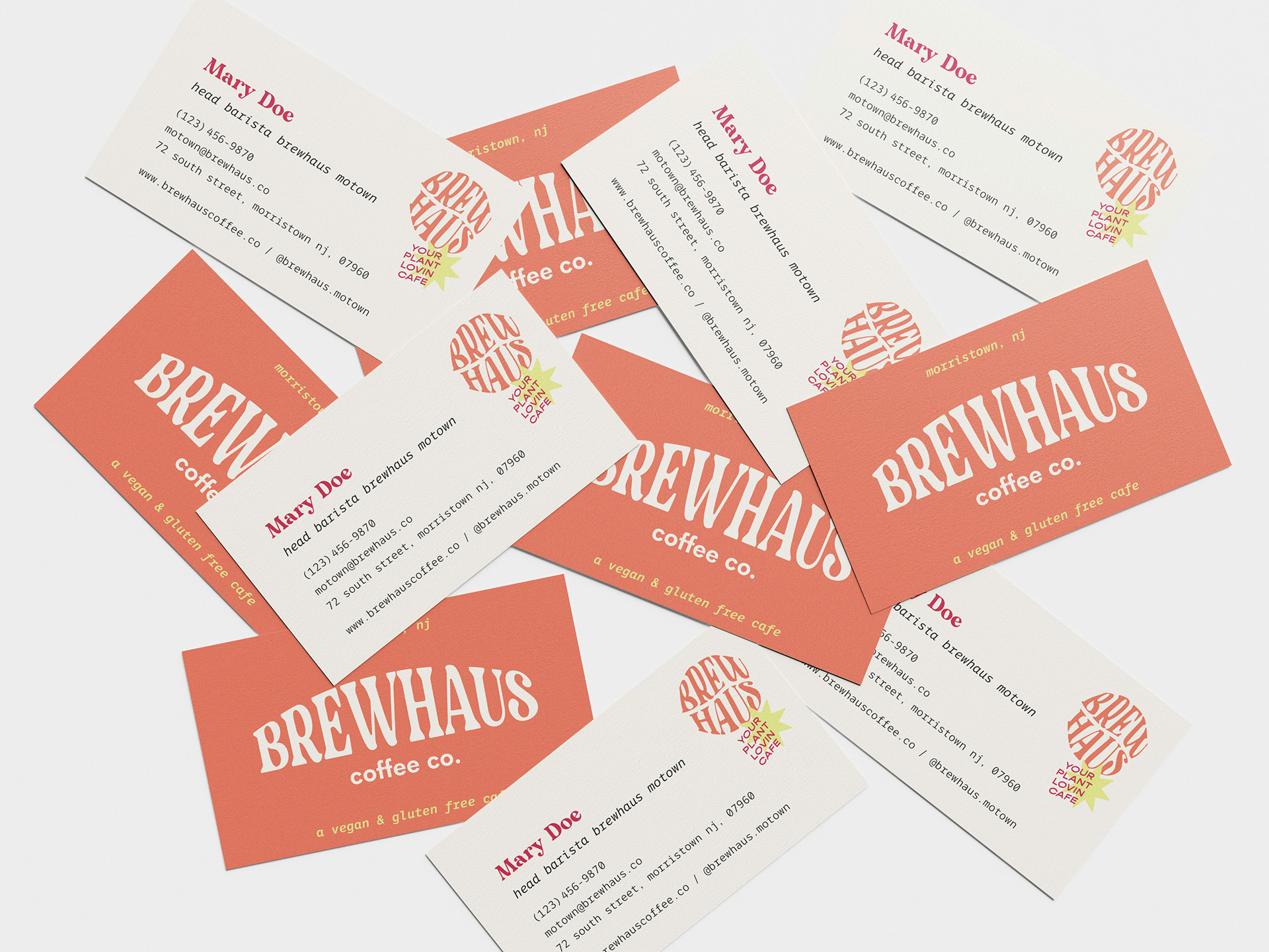
For this project I wanted to push the boundaries of what I have designed in the past, to challenge what colors I use, as well as how they are executed. Rather than veering away from a neon green and bright purple I decided to use these tones A LOT and to be purposeful with each use. For every use of color there were decisions to be made, to ensure that each piece was balanced while being pleasing to the eye.
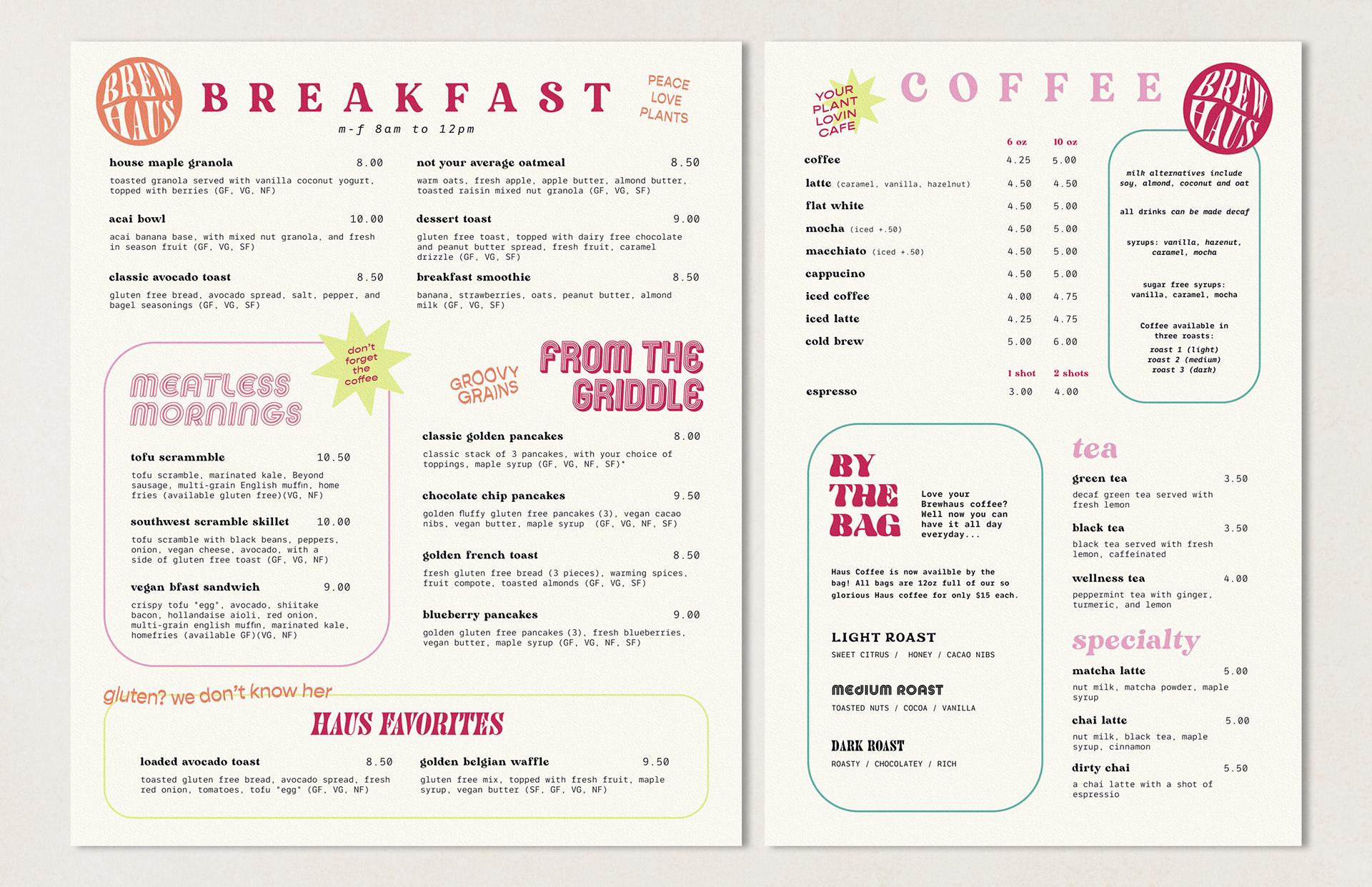
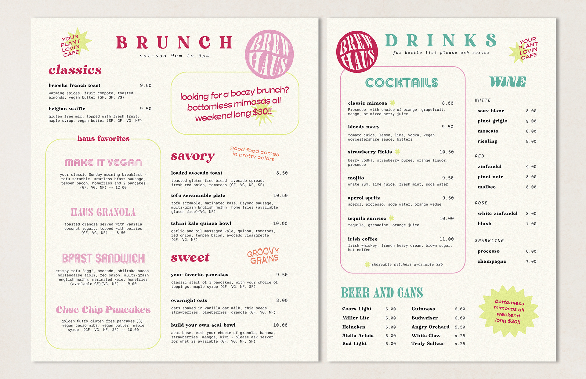
A great example of this process is within the Brewhaus menus. Each menu has its own color scheme so that when viewed together the Brewhaus brand is communicated to the viewer in its entirety.




The desktop and mobile sites were designed within Adobe XD. I used the prototype feature to preview how each version of the site would function as though the files were being sent to a developer.
Below is a walkthrough of the Brewhaus app.

