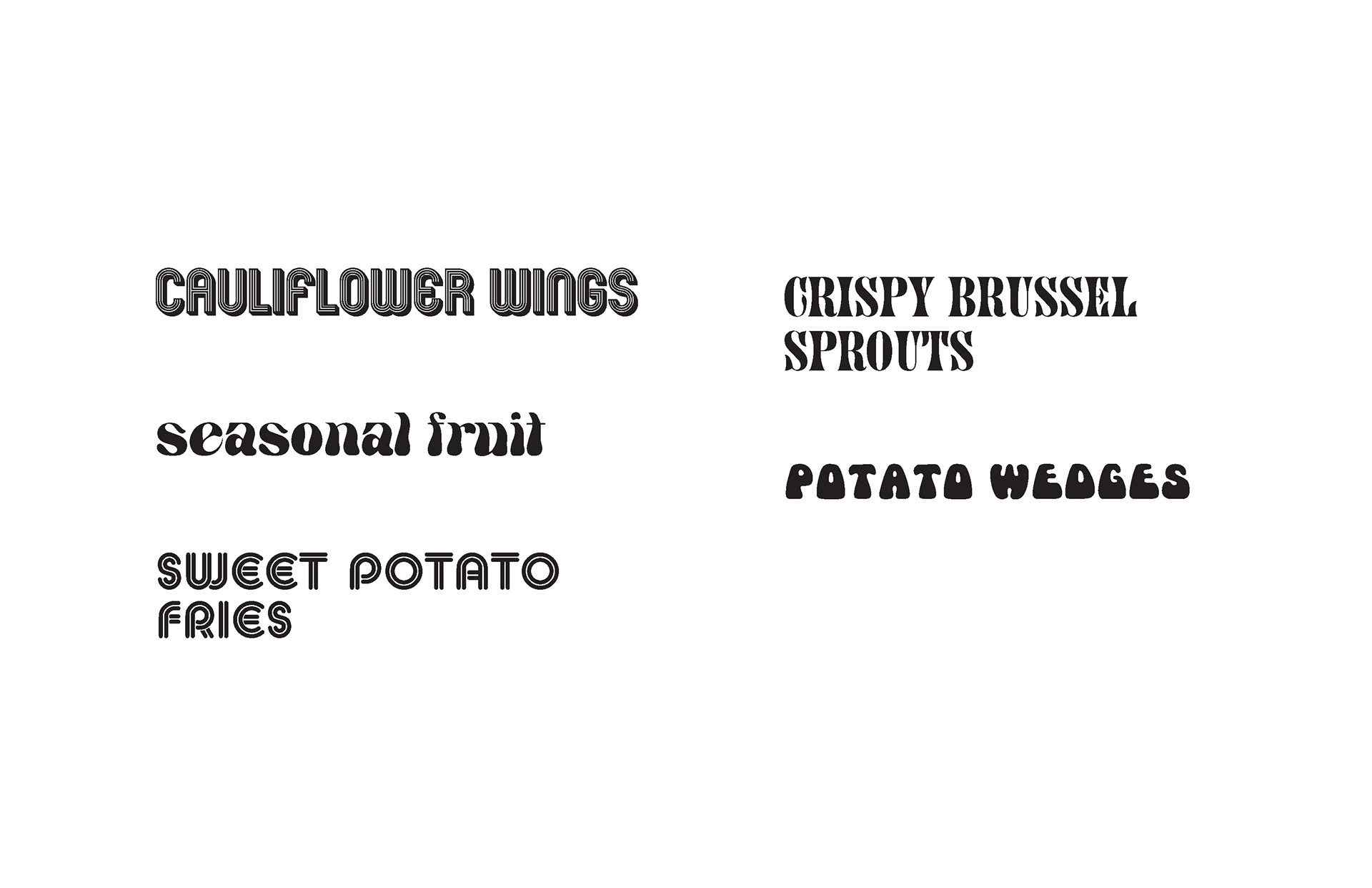
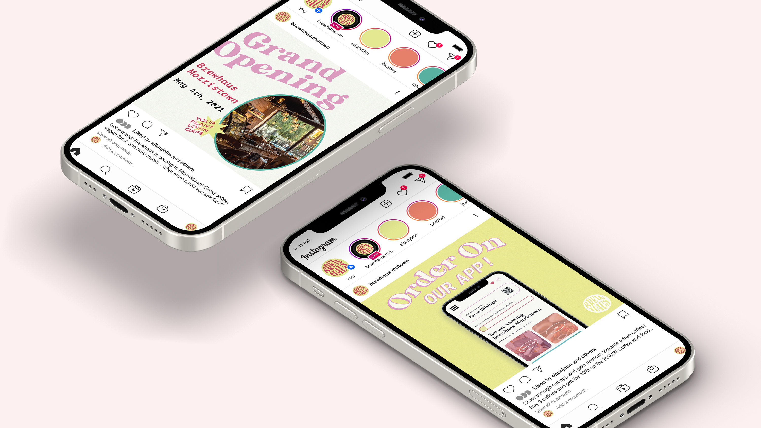
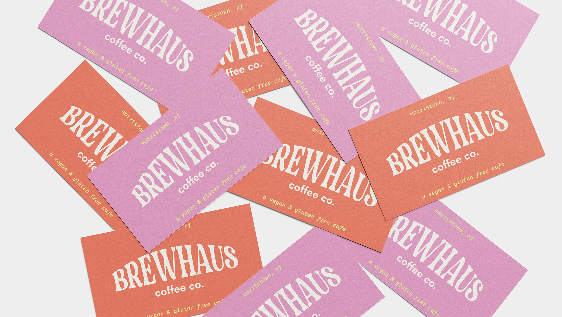
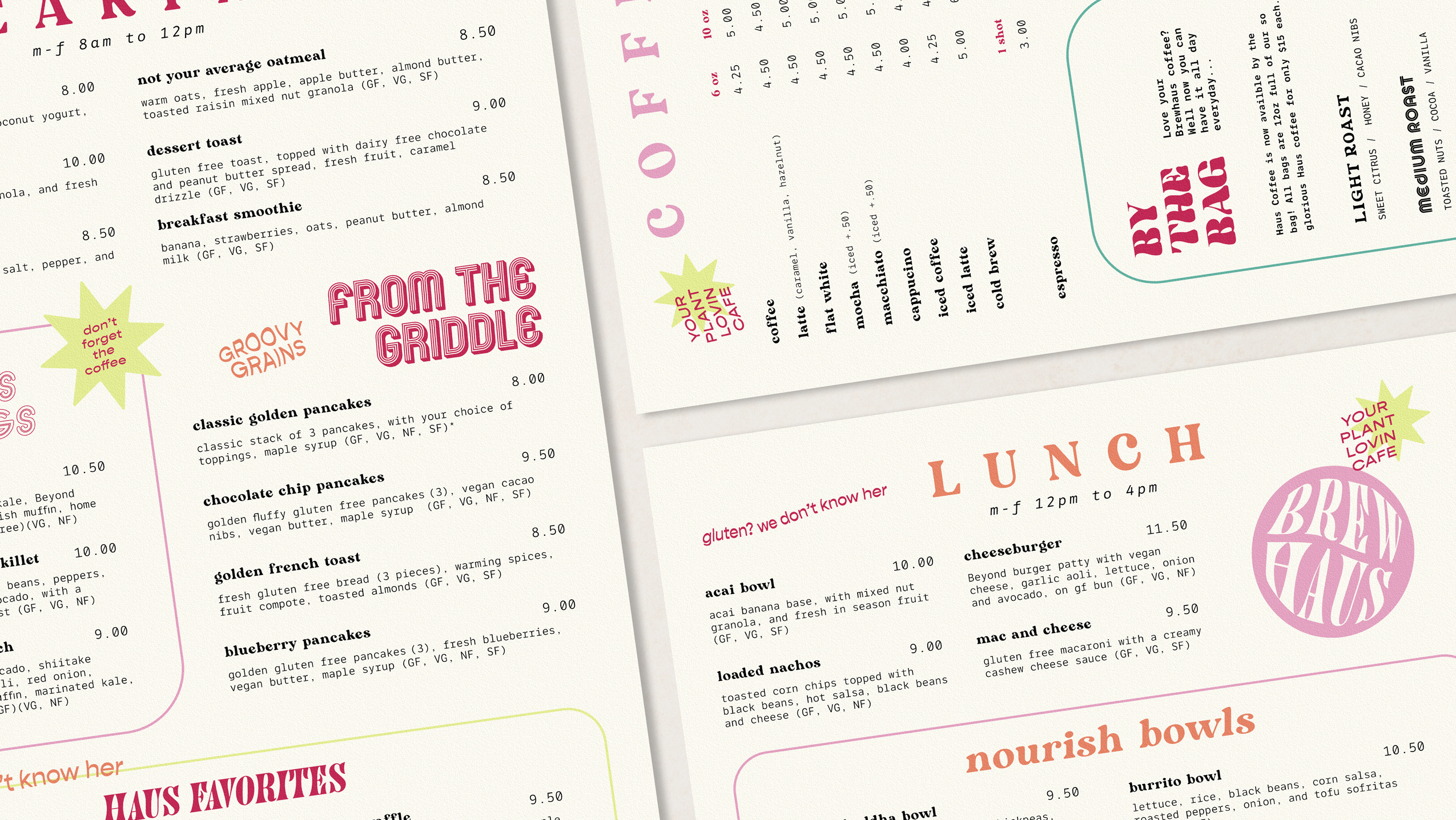
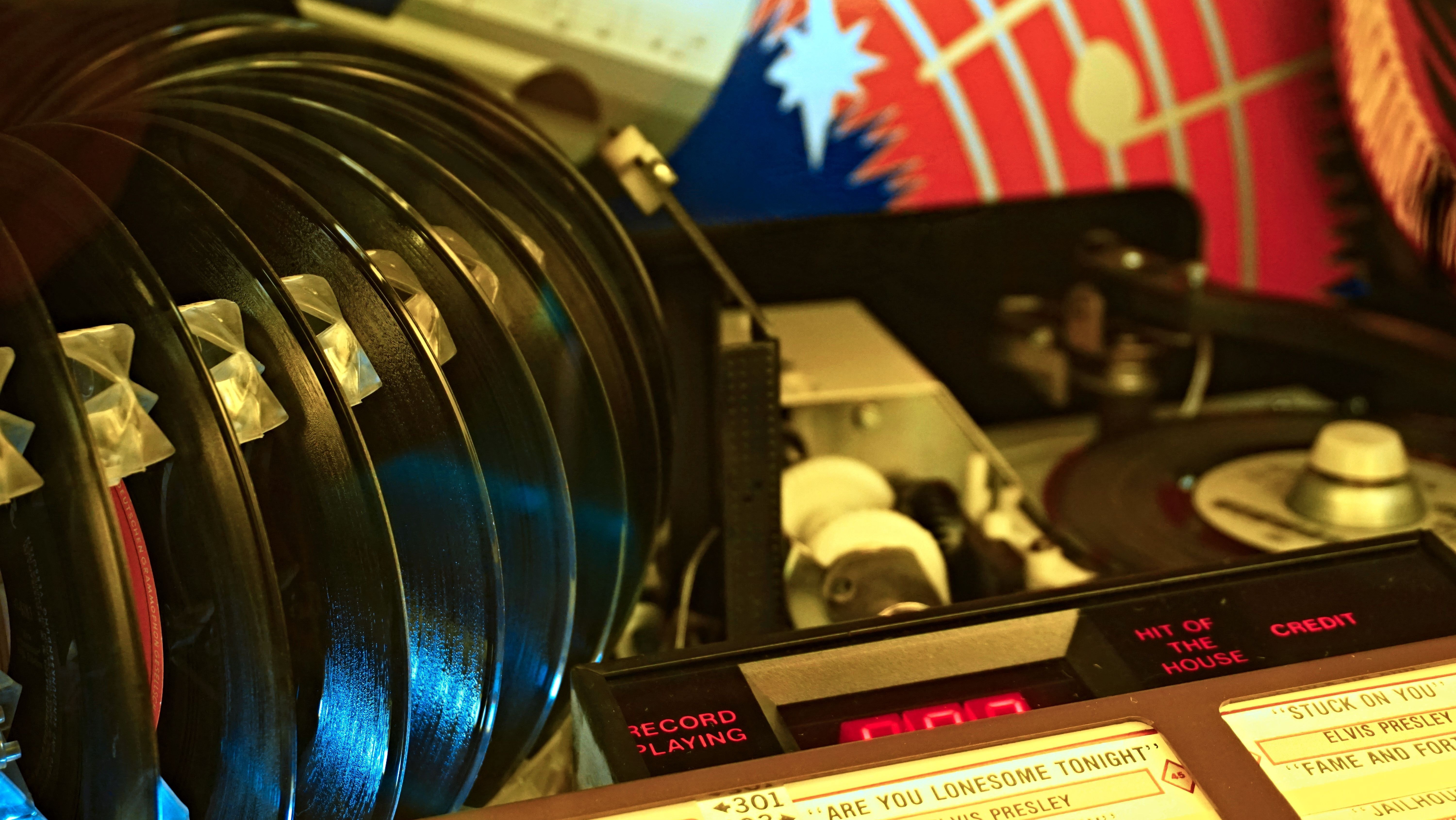
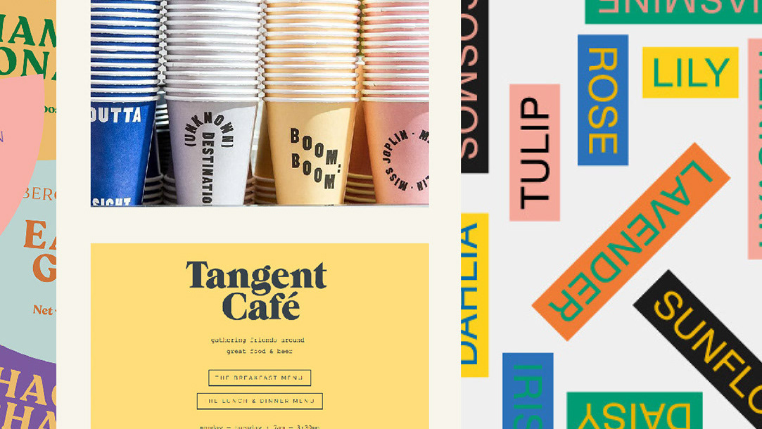
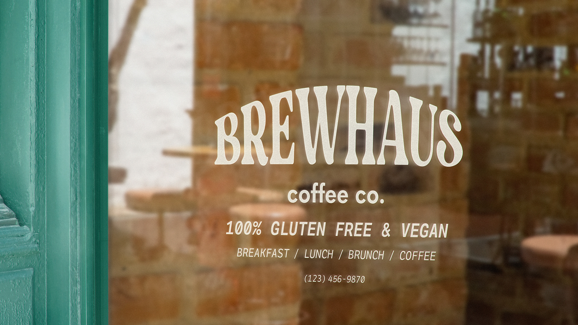
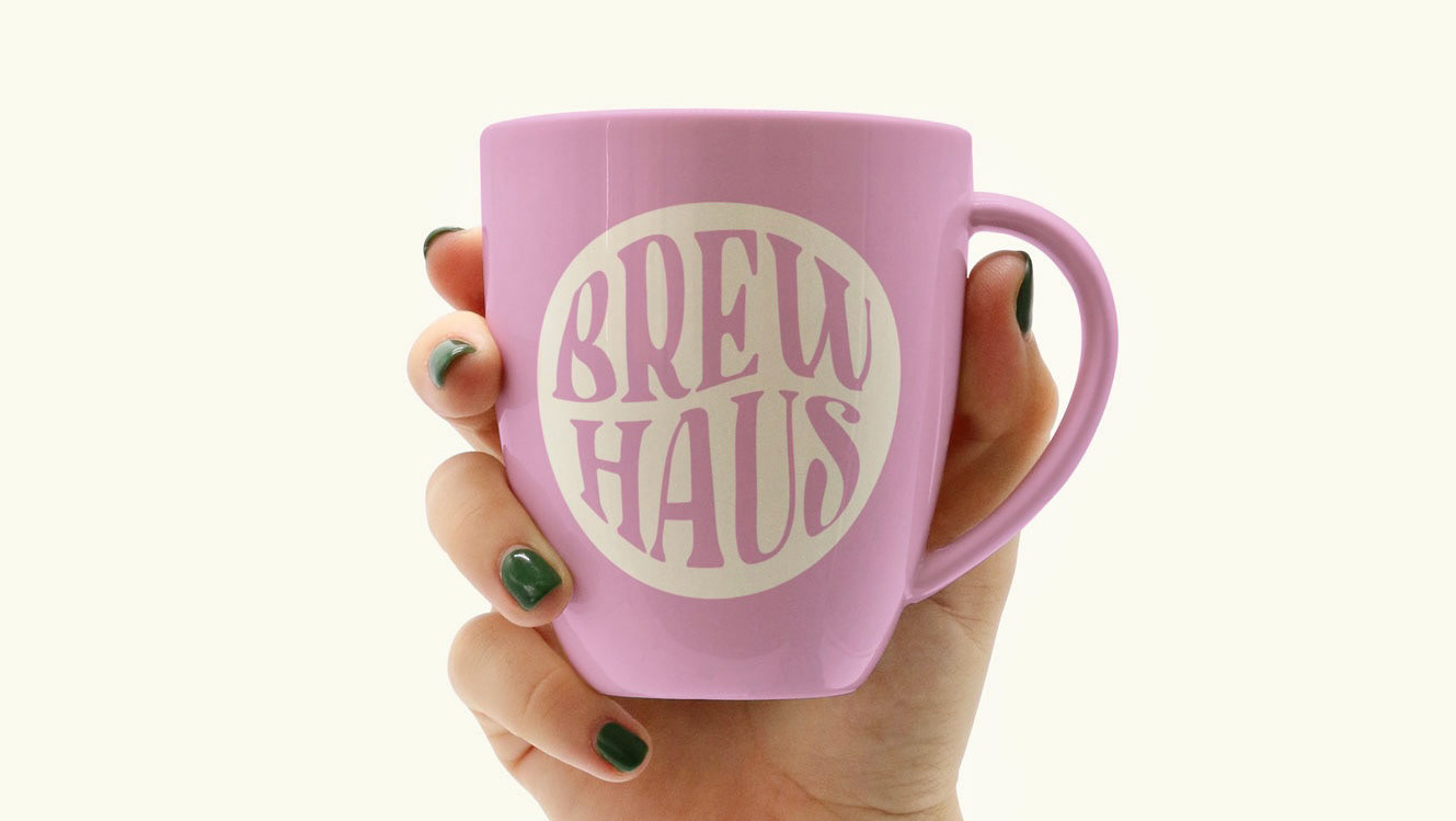
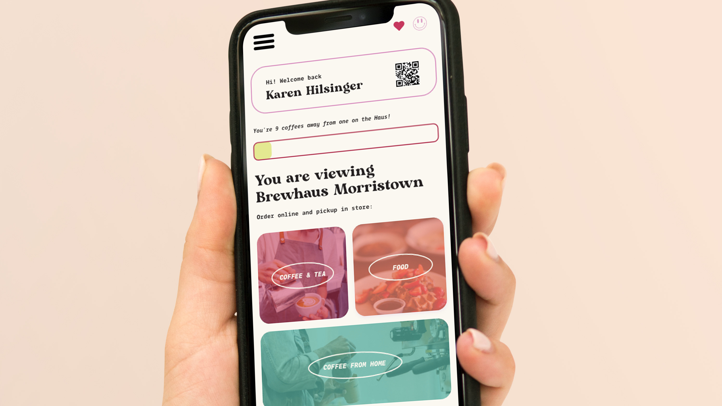
When developing the Brewhaus brand I wanted to make sure that Brewhaus had a retro vibe. I did not want to copy 60's-70's design, but rather pull inspiration from this era, to create a retro-in-2021 feel. I accomplished this by combining funky colors and type with an overall minimal aesthetic. This allowed the elements to live on their own and not fight within the composition.
A closer look at the Brewhaus brand...
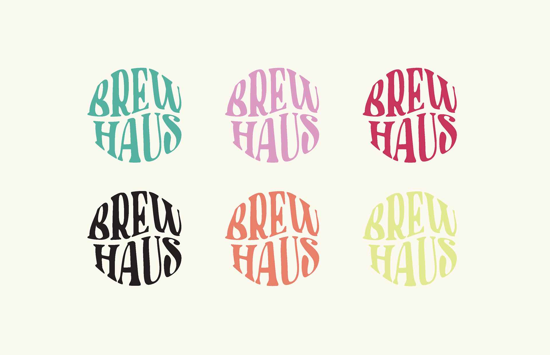
Color Palette Shown Through Logos
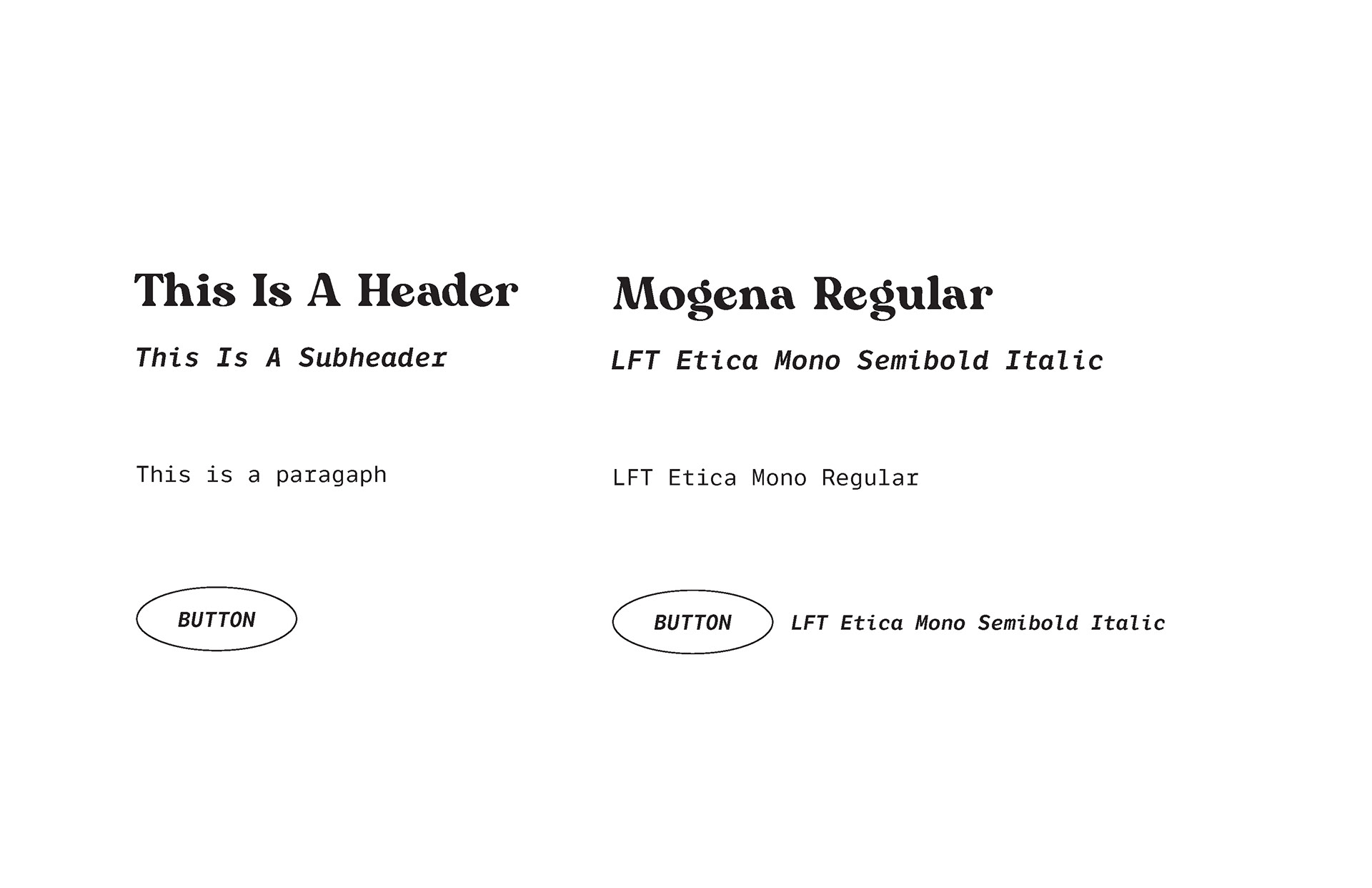
Type Hierarchy for Website and App Design
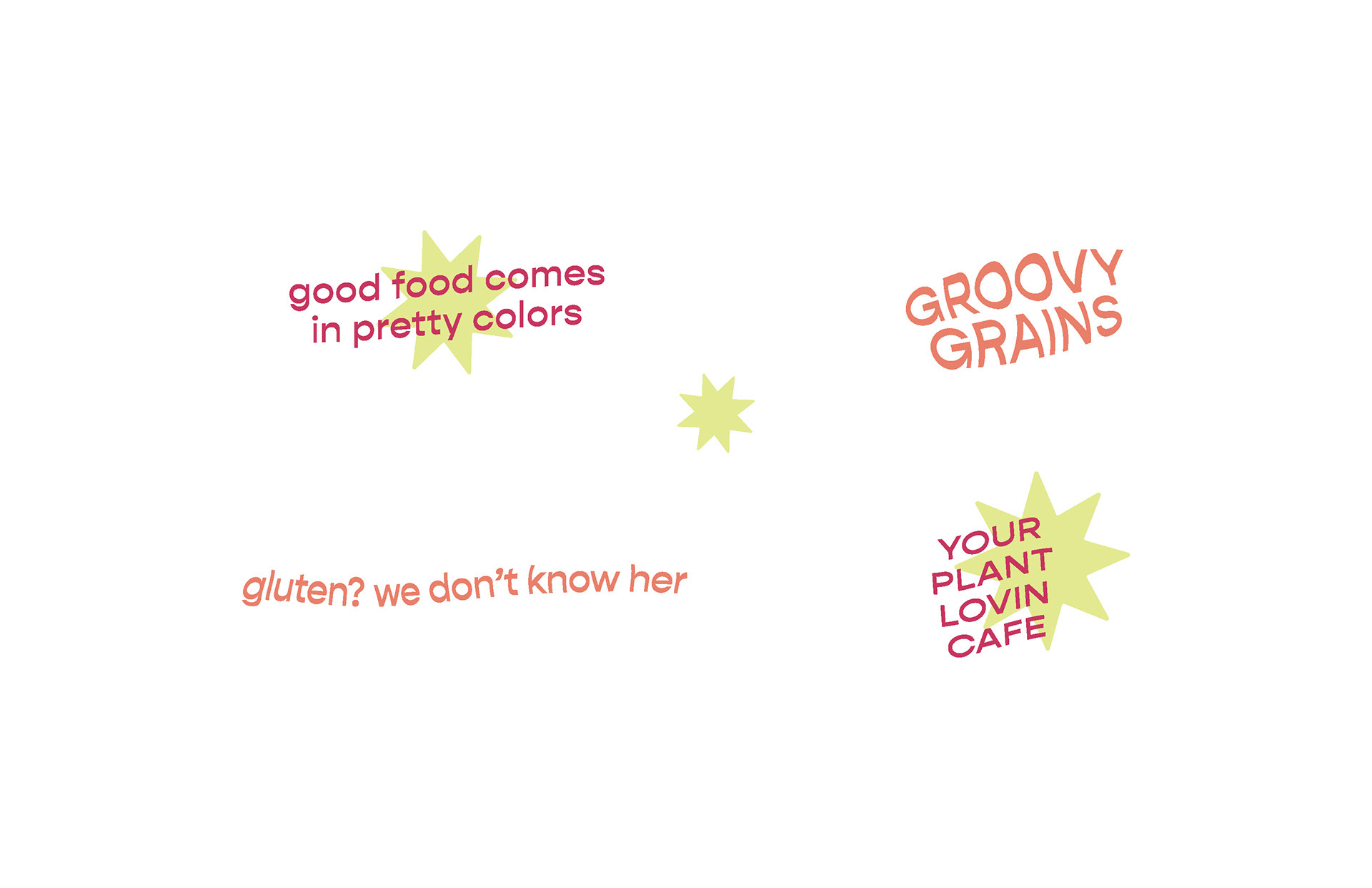
Additional Brandmarks
